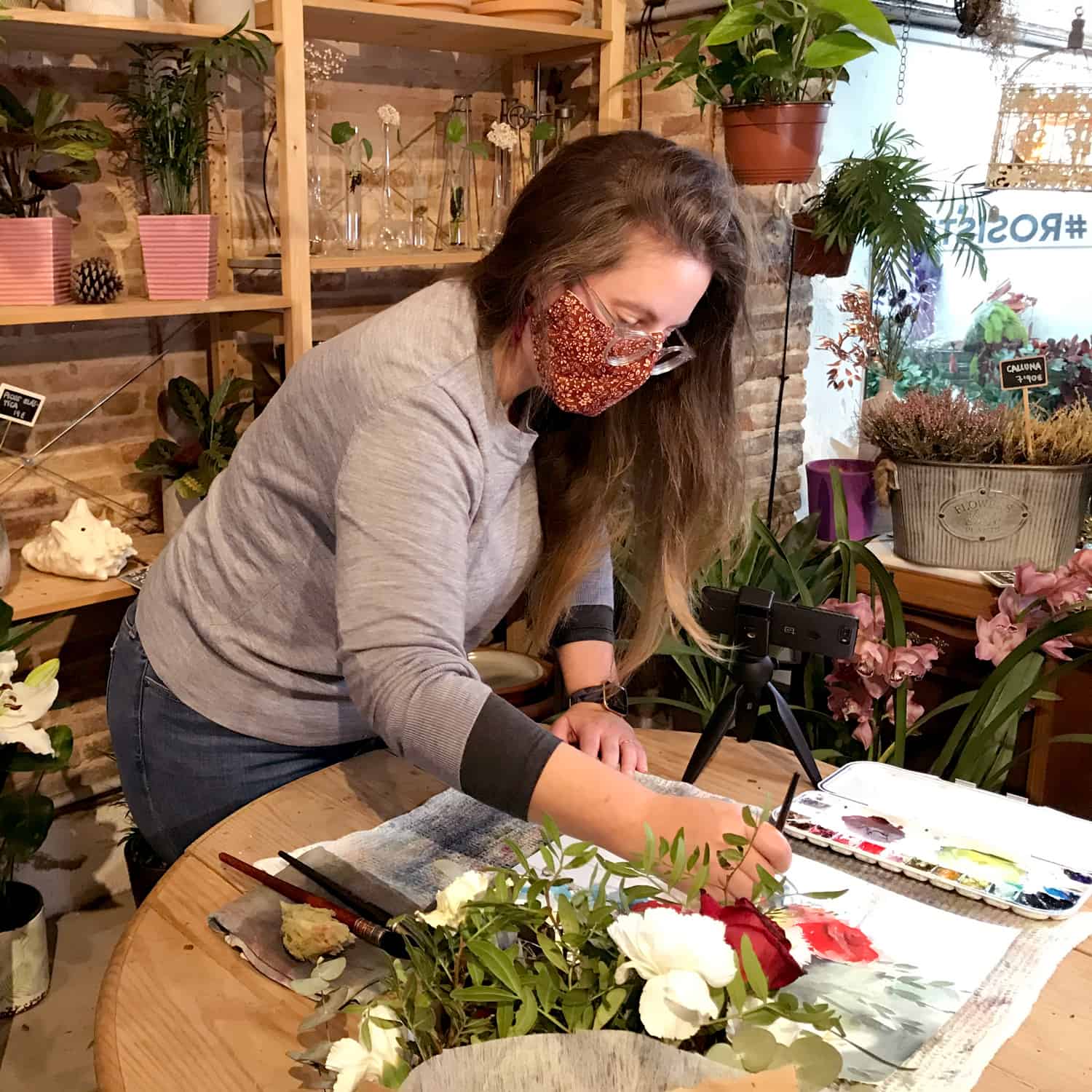
For this second opus of How to love a color, i’ve chosen to talk about quinacridone gold. One of my favorite color !
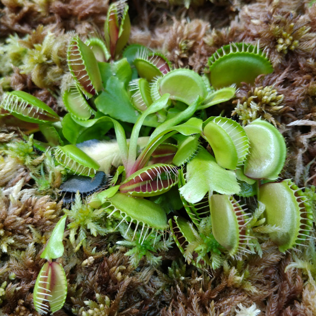
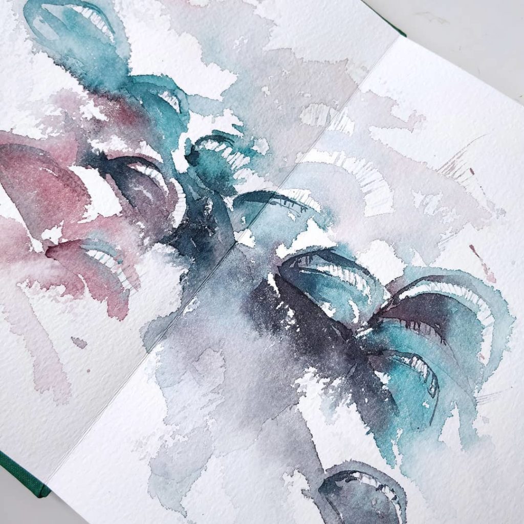
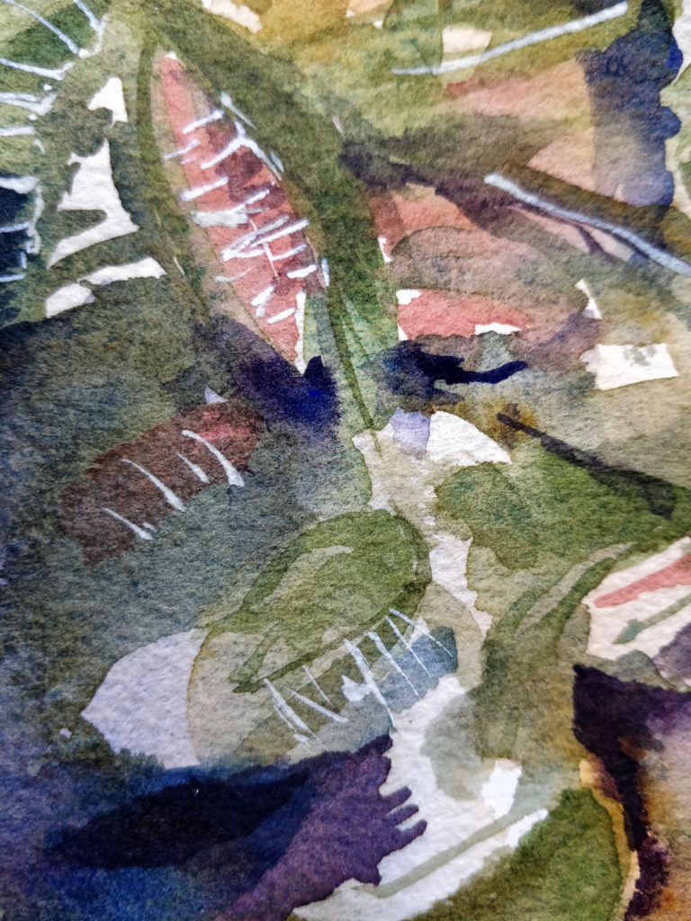
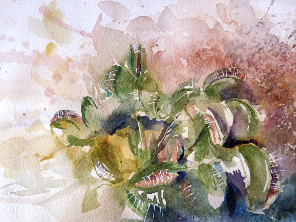
Before going un the details of this color, i wanted to show you my reference image. It’s a carnivorous plant, a Venus flytrap i believe, very delicate and with some interesting shapes. I’ve tried first painting it in a more abstract way (the picture on the right). This first version was my way of finding how to paint this plant. Back then i was in need of searching, testing, and trying in order to understand how this plant is structured.
Quinacridone gold is a gold yellow, very transparent and without any granulation. I’m using this color alone or in a mix. My most favorite mix is quinacridone gold with ultramarine blue. This particular mix allows me to get a large variety of very natural greens. And it’s easy to tweek the color by adding more of one or the other color. My tube is quite old and it’s the original formulation with the pigment PO49. But it doesn’t exist anymore sadly. So the most common mix for this color is now PO48 with PY150. You can have a look of this different formulations with different brands here. I haven’t tried this new version for now but i should do it quite soon because i don’t have much left in my tube !
Anyhow, i’ve forgot to tell in my video about a particularity of quinacridone gold. When this colors is put in a wet area it will “swoosh” across the area very quickly. The pigment is able to move a lot and can even push back some other colors. It’s quite handy when painting gold heart in a flower. But this could be also a bad thing, as this color has a tendency to overflow everywhere !
Loving quinacridone gold
Supplies :
Brushes : Raphaël “le 803″ nº2, Silver Brush Black Velvet 1/4” dagger shape.
Paper : Arches rough 300gsm.
Colors : Ultramarine blue (Daniel Smith), Viridian (Schmincke), Quinacridone gold (Daniel Smith), Permanent alizarine crimson (Daniel Smith), White ink (Winsor & Newton).
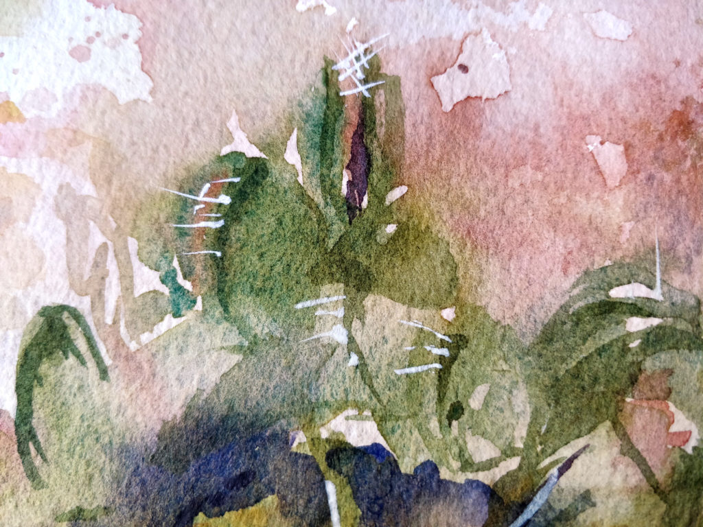
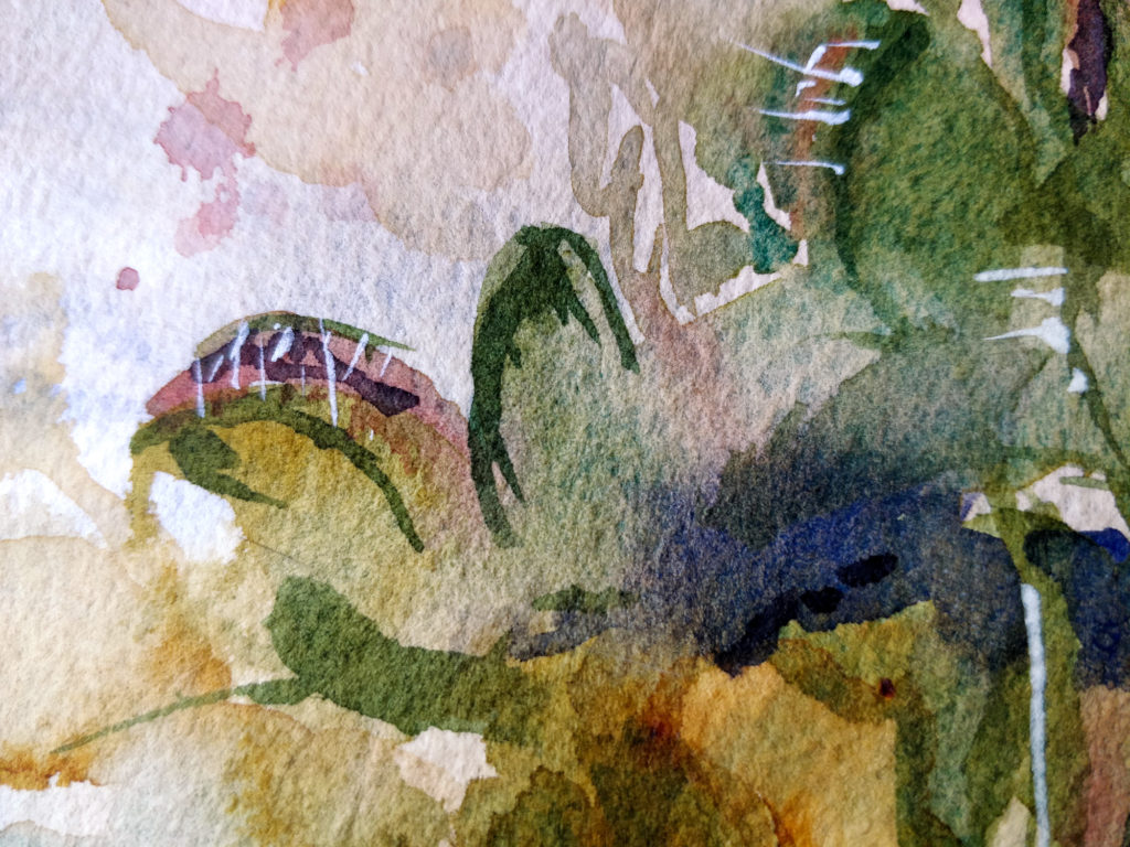
And here you have the finished painting (click to enlarge):

