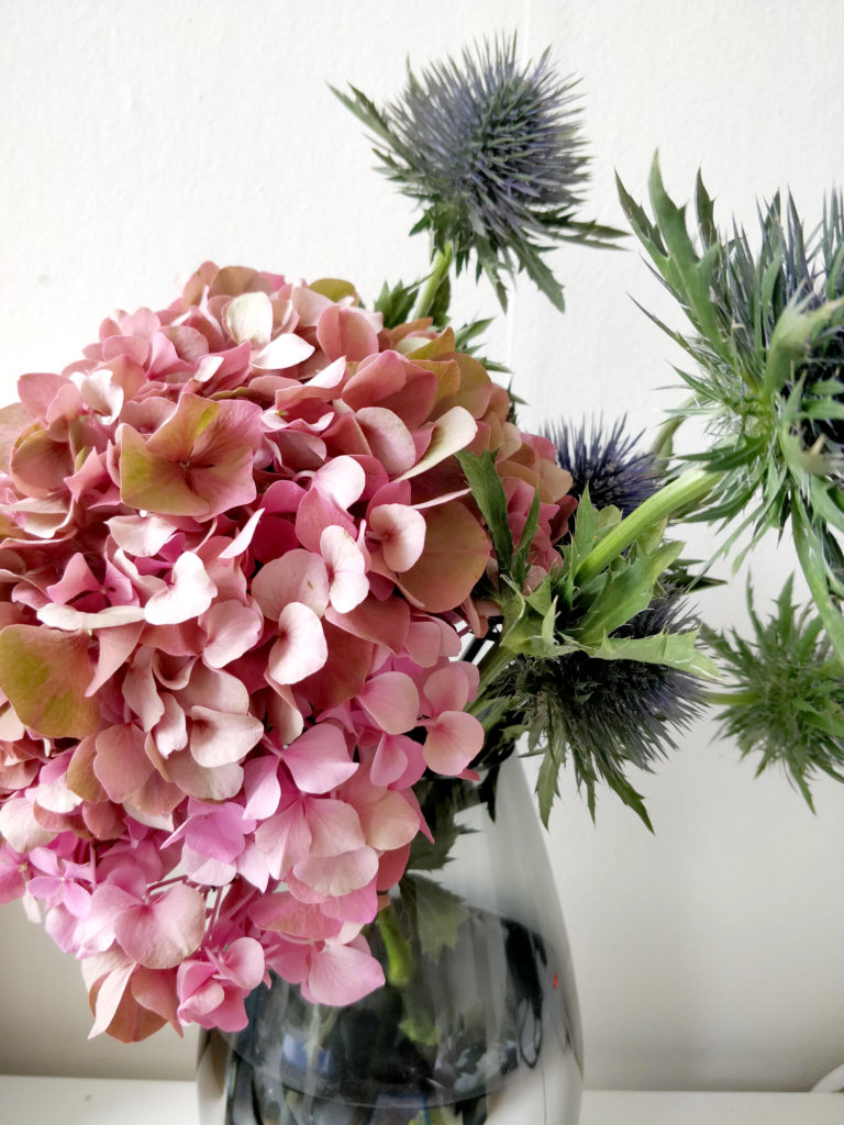
This week, i’m painting a bouquet that embellish my living room for several days now : some hydrangea and thistle. Yes. It’s an odd combination and you should have seen the face of the florist when i ordered it, that was quite funny ! But i’ve chosen those two plants for a good reason !
The colors of those two elements are complementing each other very well. The pink-orange-green of the hydrangea against the blue-green-violet of the thistle enhance each other. On a graphic side, they are also complementary : where the hydrangea is all about softness and roundness, the thistle is pointed and sharp. Above you can have a look on my reference image in order to have an idea of the composition. And the little bonus here is that this kind of bouquet last for a very long time !
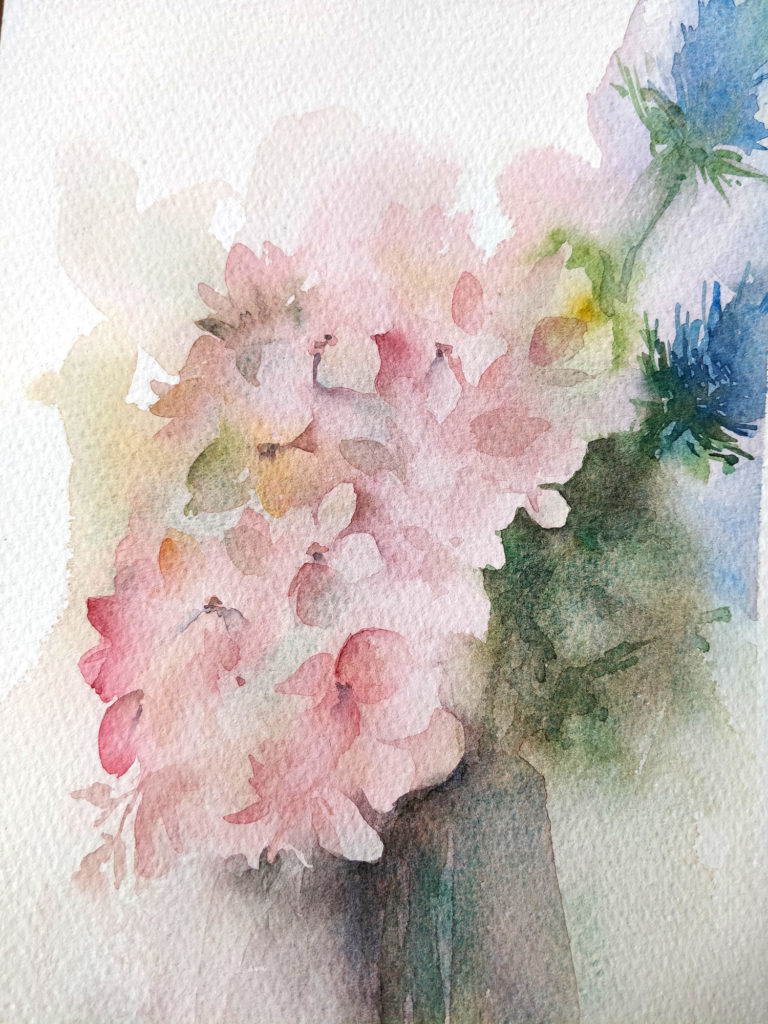
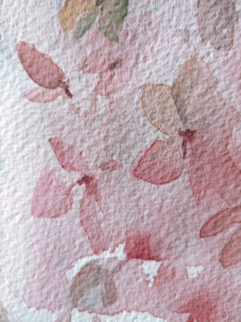
Before recording this video, i’ve made a little first try that you can see also above. It helps me choose the colors i wanted and work the composition. here in this first version, i have the feeling that the composition is unbalanced and the thistle was too much lost in the background. So i modified it in my video !
Watercolor hydrangea and thistle in video
SUPPLIES :
Brush : Escoda Aquario nº18.
Paper : Canson Héritage rough.
Colors : Ultramarine blue (Daniel Smith), Viridian (Schmincke), Quinacridone gold (Daniel Smith), Winsor red (Winsor & Newton), Permanent alizarine crimson (Daniel Smith).
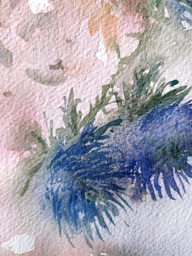
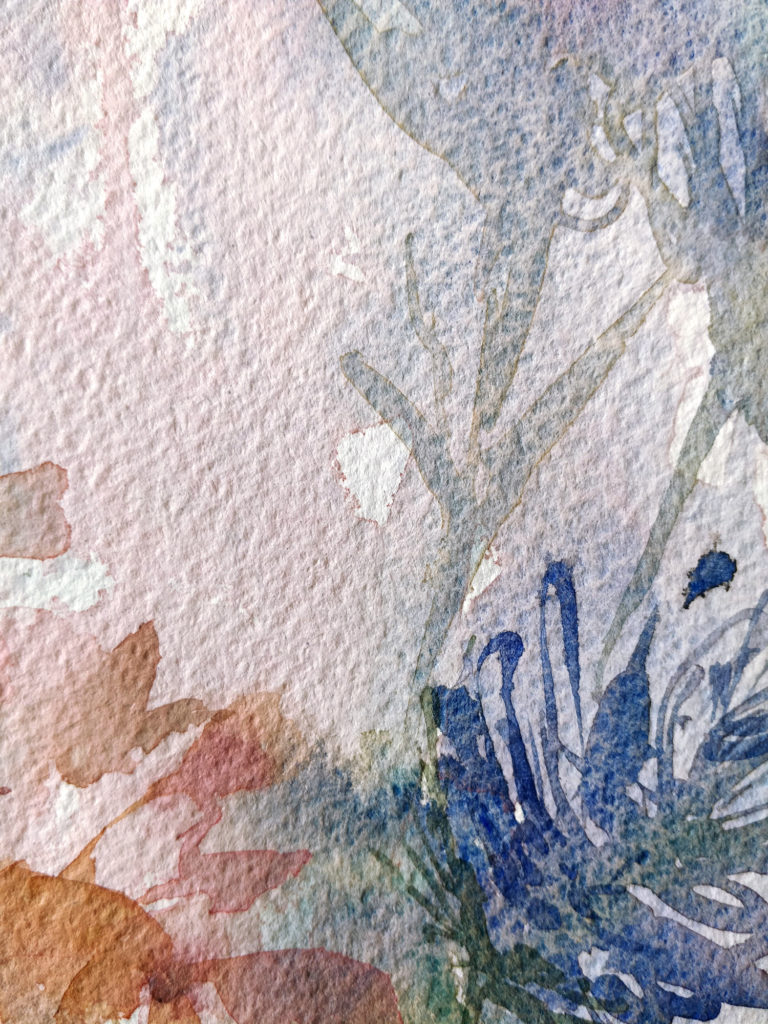
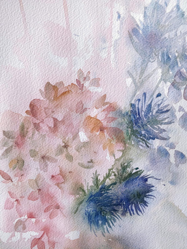
This second version is way more balanced and dynamic, in my opinion. The diagonal formed by the thistles pull the composition towards the top and this effect is even more accentuated with the drips of colors done in the first wash. The use of ultramarine blue and viridian, granulated colors, brings a very interesting texture in the thistle which hustle a little bit the softness of the hydrangea. I’ve also chosen to paint the vase with a darker color but i didn’t add any details there in order to keep the attention focus on the hydrangea.
And here you have the final result with some details (click to enlarge) :

