This week, i’m going back a well loved subject of mine : hydrangeas. But this time i want to use this subject as an experiment for playing with colors and creating a feeling.
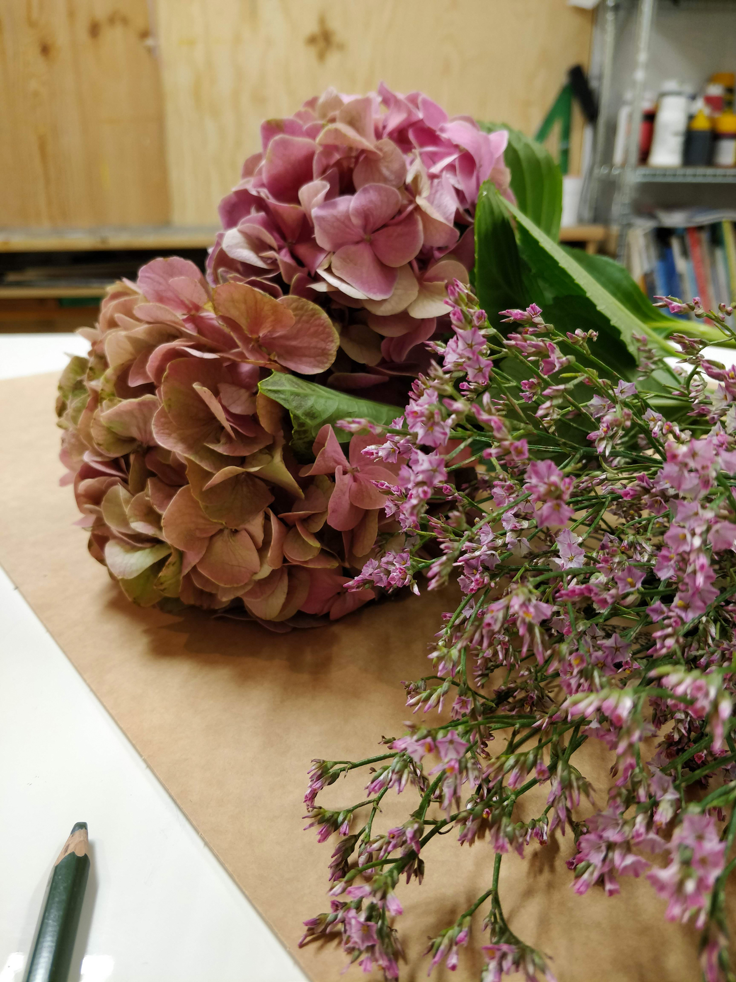
I have some “new” colors i’m playing with for a few weeks now but i don’t know them so well. In order to know them better, i just have to paint with them ! So i choose a fairly simple subject so that i can focus myself on the colors i’m using. Right above you can have a look at my bouquet of hydrangeas, the subject of this week’s video.
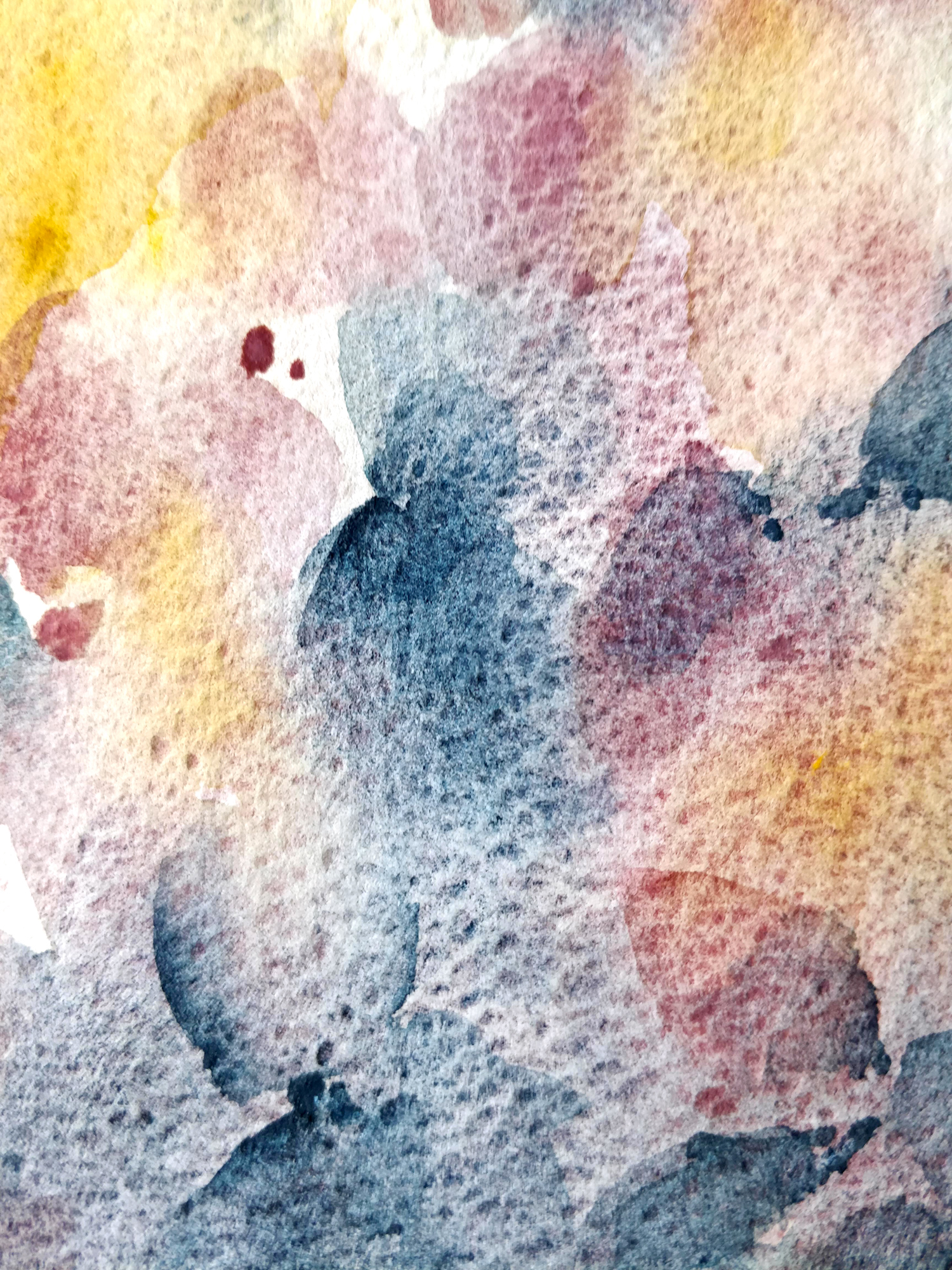
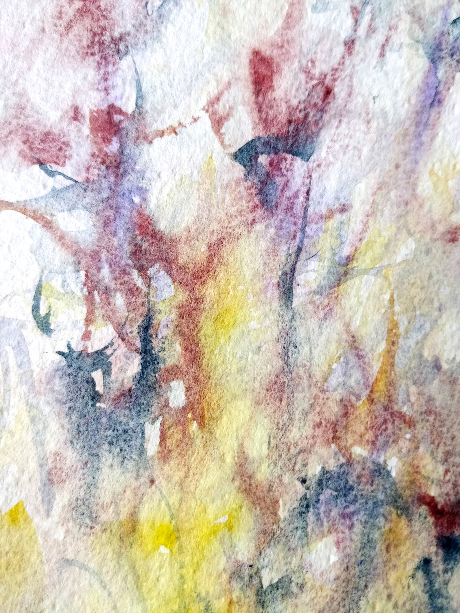
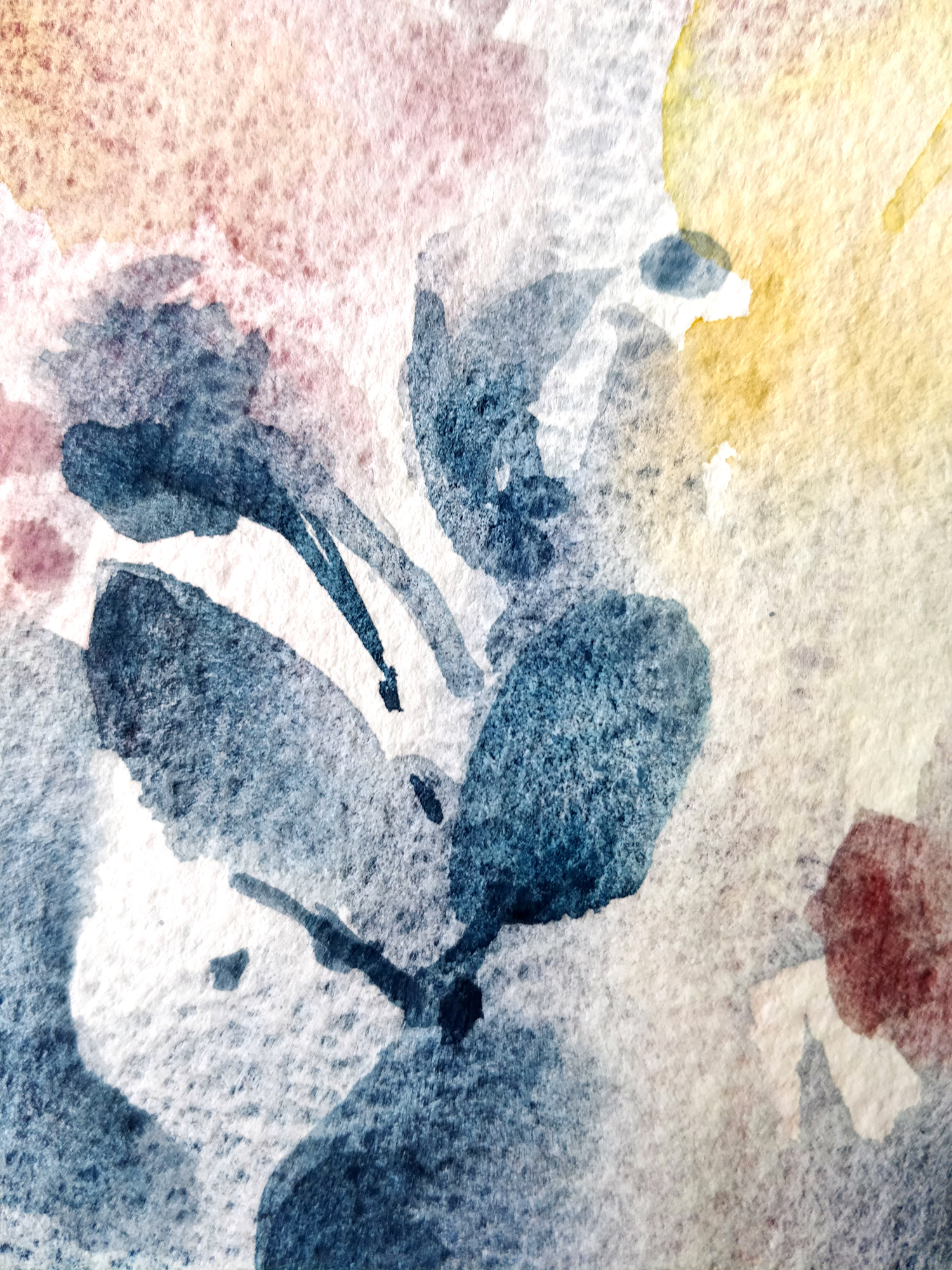
I also wanted to change my paper a little bit as i was working quite a lot with hot pressed paper this past few weeks. I’ve chosen rough paper for this one as it will enhance the granulation of some of the paints i’m using like Lunar blue and Potter’s pink. This association of color is, as i said in the video, a great surprise. Both of them are a little bit dull and Potter’s pink has some earth tone in. The mixes i get from those two are very soft and you are able to see all the pigments that composed the colors separating a little bit on the paper.
As this painting was all about experimenting with colors, some associations weren’t a success. Aussie red gold, Potter’s pink and Lunar blue are working very well together. But if i add Nickel azo yellow and cobalt violet, it’s not working anymore. It’s mainly those two last colors are way cooler and brighter than the first ones. And even if i’m a bit disappointed that it’s not working as well as i thought, i’m happy to have try and learn that i do not like it ! And it was the very goal of this experimentation !
Watercolor hydrangeas in video
Supplies :
Brush : Escoda aquario nº18, Rosemary & Co Serie 39 1/2″, Raphaël petit gris le “803” nº2.
Paper : Canson Héritage rough.
Colors : Aussie red gold (Daniel Smith), Nickel azo yellow (Daniel Smith), Potter’s pink (Schmincke), Lunar blue (Daniel Smith), Quinacridone burnt scarlet (Daniel Smith), Cobalt violet (Schmincke).
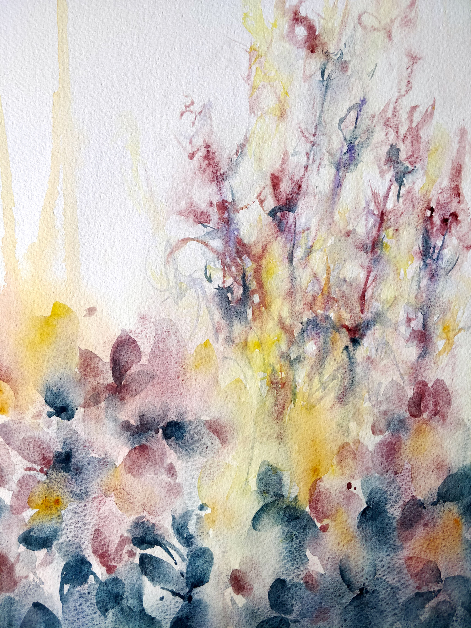
And here you have the finished painting (click to enlarge) :

